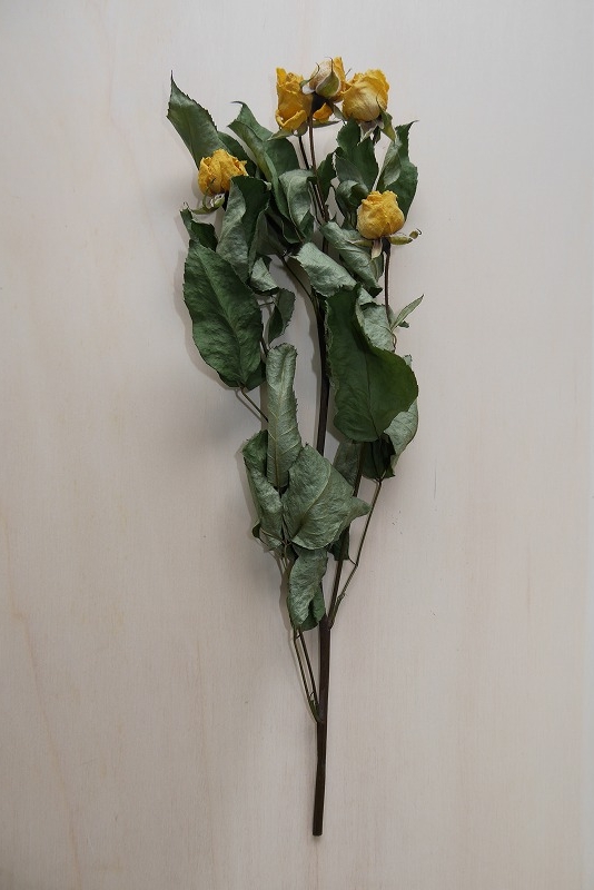

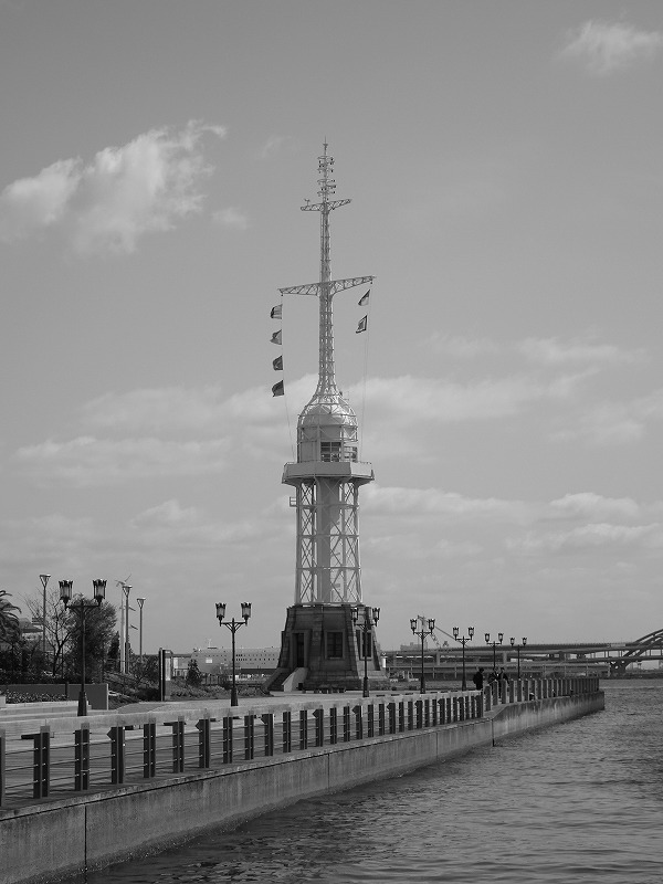
CSSのbackground-blend-modeを使って写真を重ねたイメージをつくれる。
重ね合わせの順番を変えることで、出来上がるイメージが変わる。写真を複数枚重ねることもできるし、色を重ねることもできる。
|
|
|
<style>
.img-box {
	width: 300px;
	height: 400px;
	margin: 0;
	padding: 0;
	display: block;
}
.hard-light1 {
	background-image: url(img/flower1.jpg), url(img/texture1.jpg);
	background-repeat: no-repeat;
	background-blend-mode: hard-light;
	background-size: cover;
}
.hard-light2 {
	background-image: url(img/texture1.jpg), url(img/flower1.jpg);
	background-repeat: no-repeat;
	background-blend-mode: hard-light;
	background-size: cover;
}
.hard-light3 {
	background-image: url(img/flower1.jpg), url(img/texture1.jpg), url(img/tower1.jpg);
	background-repeat: no-repeat;
	background-blend-mode: hard-light;
	background-size: cover;
}
.hard-light4 {
	background-image: url(img/texture1.jpg), url(img/flower1.jpg), url(img/tower1.jpg);
	background-repeat: no-repeat;
	background-blend-mode: hard-light;
	background-size: cover;
}
</style>

<div class="img-box hard-light1"></div>
<div class="img-box hard-light2"></div>
<div class="img-box hard-light3"></div>
<div class="img-box hard-light4"></div>
texture1 |
flower1 |
texture1 tower1 |
flower1 tower1 |
<style>
.blue { background: #0bd no-repeat; }
.yellow { background: #db0 no-repeat; }
</style>

<div class="img-box blue hard-light1"></div>
<div class="img-box blue hard-light2"></div>
<div class="img-box blue hard-light3"></div>
<div class="img-box blue hard-light4"></div>
flower1 texture1 |
texture1 flower1 |
flower1 texture1 tower1 |
texture1 flower1 tower1 |
flower1 texture1 |
texture1 flower1 |
flower1 texture1 tower1 |
texture1 flower1 tower1 |
texture1 |
flower1 |
texture1 tower1 |
flower1 tower1 |
flower1 texture1 |
texture1 flower1 |
flower1 texture1 tower1 |
texture1 flower1 tower1 |
flower1 texture1 |
texture1 flower1 |
flower1 texture1 tower1 |
texture1 flower1 tower1 |
texture1 |
flower1 |
texture1 tower1 |
flower1 tower1 |
flower1 texture1 |
texture1 flower1 |
flower1 texture1 tower1 |
texture1 flower1 tower1 |
flower1 texture1 |
texture1 flower1 |
flower1 texture1 tower1 |
texture1 flower1 tower1 |
texture1 |
flower1 |
texture1 tower1 |
flower1 tower1 |
flower1 texture1 |
texture1 flower1 |
flower1 texture1 tower1 |
texture1 flower1 tower1 |
flower1 texture1 |
texture1 flower1 |
flower1 texture1 tower1 |
texture1 flower1 tower1 |
texture1 |
flower1 |
texture1 tower1 |
flower1 tower1 |
flower1 texture1 |
texture1 flower1 |
flower1 texture1 tower1 |
texture1 flower1 tower1 |
flower1 texture1 |
texture1 flower1 |
flower1 texture1 tower1 |
texture1 flower1 tower1 |
texture1 |
flower1 |
texture1 tower1 |
flower1 tower1 |
flower1 texture1 |
texture1 flower1 |
flower1 texture1 tower1 |
texture1 flower1 tower1 |
flower1 texture1 |
texture1 flower1 |
flower1 texture1 tower1 |
texture1 flower1 tower1 |
texture1 |
flower1 |
texture1 tower1 |
flower1 tower1 |
flower1 texture1 |
texture1 flower1 |
flower1 texture1 tower1 |
texture1 flower1 tower1 |
flower1 texture1 |
texture1 flower1 |
flower1 texture1 tower1 |
texture1 flower1 tower1 |